squareup.com — design breakdown

Fintech · Dark · Light

Square — payments with clean hardware design. Square clean commerce, black-white hardware shots, small business warmth. This page breaks down the measurable design decisions behind the site — the extracted color palette, typography, tone of voice — and generates a complete vibe-coding prompt that recreates the same design language in Lovable, Cursor or v0.

Screenshot of the squareup.com homepage — Fintech web design example
The squareup.com front page as captured for the Norrly library.

Color palette

The dominant colors extracted from the live site:

#303030#f0f0f0#000000#606060#c0c0c0

Typography & voice

Heading fontSquare Sans Display VF
Body fontCash Sans
Hero headline“Local legend or global icon. Make it big on your block.”
CategoryFintech

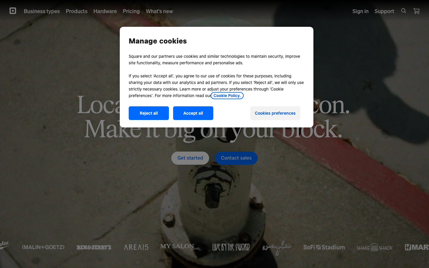
Voice: confident and premium; open and approachable. Hero headline: “Local legend or global icon. Make it big on your block.”

What squareup.com does well

Apply it to your own project

The vibe-coding prompt

Norrly generates a complete founding prompt from the measured values above — theme, exact hex colors, type scale, button geometry, section structure, motion rules and hard constraints. Paste it into Lovable, Cursor, v0 or Bolt to start from squareup.com's design language instead of AI defaults. A preview:

You are a world-class web designer + frontend engineer. Build an original single-page landing page in the exact design language of squareup.com (fintech — Square — payments with clean hardware design.) Do NOT clone their content or logo; recreate the FEEL. Every token below was measured from the live site — follow them precisely, they are the product.

Stack: React + Tailwind CSS (works in Lovable, v0, Bolt or Cursor as-is). Single page, production quality, fully responsive.

━━━ 1. DESIGN SPEC (measured tokens — the source of truth) ━━━

THEME & MOOD
- Light theme: the page lives on #ffffff; dark text; whitespace creates hierarchy.
- Personality: Square clean commerce, black-white hardware shots, small business warmth. In two words: Dark + Light.
- Reference anchor: think “squareup.com” — Square clean commerce. Combine this reference with the exact values below (reference alone is vague, values alone lack character).

COLORS
- Page background: #ffffff
- Body text: #000000
- Alternate section surfaces: #000000 (use to break up long stretches of #ffffff)
- Accent (CTAs, links, ONE highlight per viewport — nothing else): #000000
Get the full prompt in the library →

The library includes a 15-second scroll recording, three screenshots, the full measured token set and the complete prompt for squareup.com and 350+ more sites. 5 sites are free to explore.

Similar styles

Dark designLight design

Related design breakdowns

Screenshot of corgi.insure — Fintech website design
corgi.insure
Fintech · Playful, Illustration
Screenshot of ramp.com — Fintech website design
ramp.com
Fintech · Dark, Colorful
Screenshot of acctual.com — Fintech website design
acctual.com
Fintech · Colorful, Playful
Screenshot of spade.com — Fintech website design
spade.com
Fintech · Dark
Screenshot of getanchor.co — Fintech website design
getanchor.co
Fintech · Minimal
Screenshot of ugly.cash — Fintech website design
ugly.cash
Fintech · Typography, Energetic