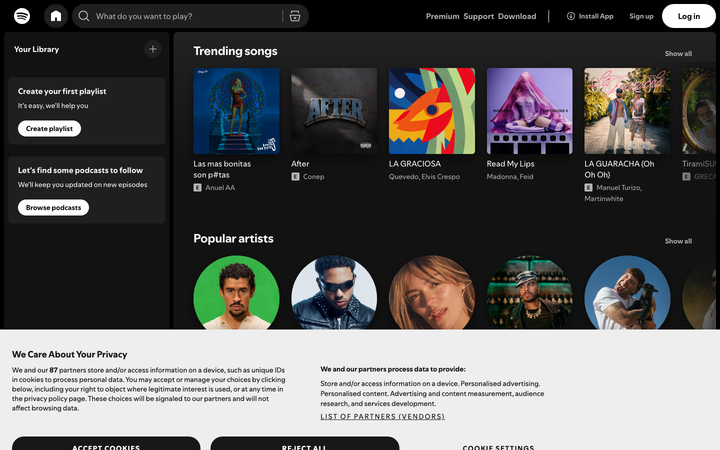
spotify.design — design breakdown
Design & Studios · Colorful · Playful · Typography
Spotify's design team publication — colorful editorial benchmark. Design culture publication, vivid brand color, playful editorial modules. This page breaks down the measurable design decisions behind the site — the extracted color palette, typography, tone of voice — and generates a complete vibe-coding prompt that recreates the same design language in Lovable, Cursor or v0.
Color palette
The dominant colors extracted from the live site:
Typography & voice
Voice: expressive and optimistic; witty and light-hearted; statement-driven — the words are the design. Hero headline: “Your Library”
What spotify.design does well
- A confident, saturated palette that makes the brand instantly recognizable.
- Personality in the details — micro-copy, hover states and illustrations that smile.
- Typography does the heavy lifting — hierarchy, scale and rhythm replace decoration.
Apply it to your own project
- Pick 1–2 signature hues and repeat them everywhere; rainbow dilutes.
- Add personality in low-risk places first: 404s, empty states, button micro-copy.
- Try designing the hero with type only — no imagery — and see how far scale and weight take you.
The vibe-coding prompt
Norrly generates a complete founding prompt from the measured values above — theme, exact hex colors, type scale, button geometry, section structure, motion rules and hard constraints. Paste it into Lovable, Cursor, v0 or Bolt to start from spotify.design's design language instead of AI defaults. A preview:
Get the full prompt in the library →The library includes a 15-second scroll recording, three screenshots, the full measured token set and the complete prompt for spotify.design and 350+ more sites. 5 sites are free to explore.