seed.com — design breakdown
Health & Wellness · Light · Minimal · Photography · Technical
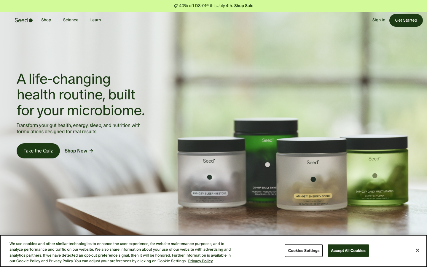
Probiotics with scientific, clinical beauty. Scientific beauty, microbiome macro photography, clinical beige minimal. This page breaks down the measurable design decisions behind the site — the extracted color palette, typography, tone of voice — and generates a complete vibe-coding prompt that recreates the same design language in Lovable, Cursor or v0.
Color palette
The dominant colors extracted from the live site:
Typography & voice
Voice: open and approachable; calm and restrained — every word earns its place; evocative, lets imagery carry the story.
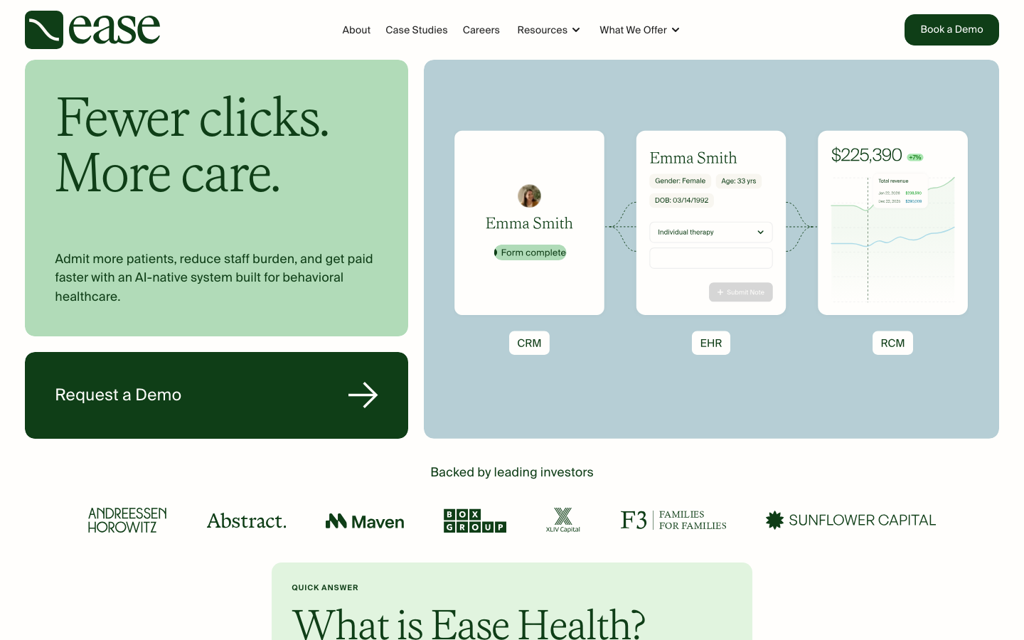
What seed.com does well
- Generous whitespace gives every element room to breathe and guides the eye naturally.
- Ruthless reduction — few elements per viewport, so each one lands with full weight.
- Art-directed imagery sets the mood before a single word is read.
- Speaks the audience's language: monospace details, diagrams and concrete specifics over marketing fluff.
Apply it to your own project
- Double your margins before adding decoration — space reads as quality.
- Cut copy until it hurts: one idea per section, one CTA per screen.
- Invest in one art-directed hero image instead of five generic stock photos.
- Show, don't claim: real code, real numbers, real screenshots build trust with technical buyers.
The vibe-coding prompt
Norrly generates a complete founding prompt from the measured values above — theme, exact hex colors, type scale, button geometry, section structure, motion rules and hard constraints. Paste it into Lovable, Cursor, v0 or Bolt to start from seed.com's design language instead of AI defaults. A preview:
Get the full prompt in the library →The library includes a 15-second scroll recording, three screenshots, the full measured token set and the complete prompt for seed.com and 350+ more sites. 5 sites are free to explore.
Similar styles
Related design breakdowns